Great Proposal Infographics Position Your Proposal for the Win.
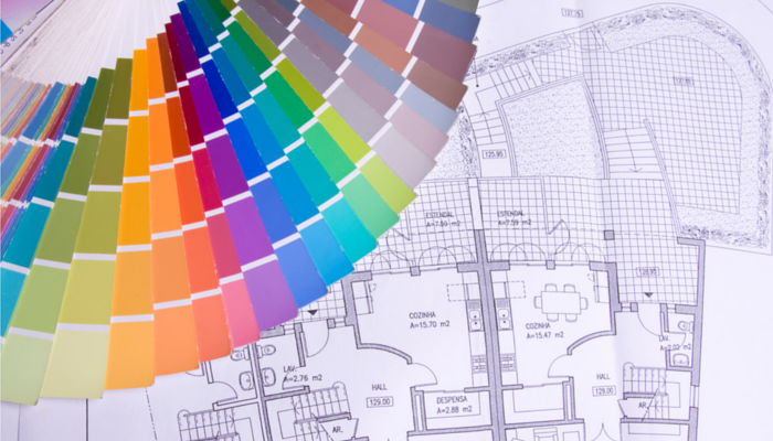
Most of reviewers need visual references to guide them through a proposal. Page after page of densely packed proposal text is difficult to read and hard to evaluate. Proposal infographics can present information, break-up long sections of text, and improve win probabilities. They can range from organization charts to process flow diagrams to detailed product designs. Infographics can be a powerful tool. Yet, they often fall short and leave evaluators wondering about the message they send. Here are 3 elements of great proposal infographics.
- The Details Matter. First, the details of your infographic need to be accurate. The evaluator will spend time reviewing the infographic details so you need to get them right. The steps in the flow chart need to be in the right order. Reporting relationships in an organization chart need to be correct. Details need to be correct in your product designs. You can build the basic graphic yourself on the back of a napkin, on a whiteboard, or in MS Power Point.
- 30 Second Rule. The infographic will fail if the evaluator cannot make sense of it in the first 30 seconds. Evaluators may not be able to find the detail they need in complicated infographics or if it does not flow. Move information and actions in your flow charts in one general direction. Link and label expanded details of the product design. Select and apply color to match your theme and create motion. A graphic artist can transform your basic graphic into an infographic.
- First Impressions Count. In fact, it only takes the evaluators two seconds to decide if they like the proposal infographic. This is rapid cognition (better known as a first impression). Evaluators can change their minds if it makes a bad first impression. But, the built-in prejudice may be hard to overcome. Great proposal infographics fall in the category of art. “I cannot describe it, but I know it when I see it.” It takes an artist to create a winning proposal infographic.
Great proposal infographics increase your win probability. They provide evaluators the visual reference points they need to make sense of your offering. They provide the details evaluators need to determine the adequacy and feasibility of your approach. They make sense, flow logically, and are easy to follow. They create a great impression on the evaluator. Use these 3 elements to create your next proposal infographic.
- When Content is King, Page Cutting Is an Art – May 13, 2023
- Five Lessons to Live By! – August 28, 2020
- Cut First, Polish Later! – May 19, 2020